10. Climate Change
Global Warming
Look at the plot below. It shows the average temperature of the Earth from 1850 to 2006. The steep temperature rise is what is called global warming.
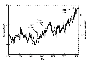
Figure 10.1. Earth average temperature 1850 to 2006
Newspapers and politicians talk about global warming nearly every day. Sometimes you’ll hear a report of a new scientific study, but more often a news report will mention global warming in the context of disaster -- a hurricane or a series of tornadoes or drought somewhere or crop failure -- that scientists say could be a consequence of global warming. The evidence appears to be so overwhelming that many people pronounce that the “debate is over”. Yet the debate continues.
In fact, much of what you hear every day is exaggerated, often on purpose. People feel so passionately about climate change, and they are so frightened about what is coming, that they overstate their case (either pro or anti) in an attempt to enlist proselytes. The heat of the debate can sometimes overwhelm the heat of global warming (which, incidentally, is real). In this section, I’ll try to give the cool description of global warming. I will not to exaggerate, either way.
The temperature of the Earth (averaged over the last decade) is now the warmest that it has been in 400 years. Figure 10.1 below shows the change since 1850 was almost 2°F (about 1oC). That doesn’t seem like a lot, and in some sense it isn’t. The reason some many people worry is that they fear that this is just a portent of what is to come. A substantial part of this rise is very likely a result of human activity, particularly by the burning of fossil fuels. If that is truly the cause, then we expect the temperature to keep rising. Although cheap oil is getting scarce, at $100 per barrel or higher there seems to be lots available. (I’ll show the numbers later in the chapter.) And the countries that need lots of energy appear to have huge amounts of coal. Burn a fossil fuel, and you dump carbon dioxide into the atmosphere, and that’s the problem. Carbon dioxide is very likely to cause significant warming, and as we burn more fossil fuels, the temperature is very likely to continue to go up. In the next 50 years, the best estimates are that the additional increase will be between 3°F and 10°F. That is a lot. Already, warming in Alaska from 1900 to the present has been enough to cause significant portions of the permafrost to melt. A 10°F rise would be enough to make fertile regions in the United States arid and trigger large-scale economic disruption around the world. There is also good reason to believe that the warming will be more intense in the polar regions.
The IPCC
Every few years, a prestigious international committee makes a new assessment of the status of climate change: what we know about it, what the consequences are likely to be, and what we can do. This organization is commissioned by the United Nations and the World Meteorological Organization, and is called the Intergovernmental Panel on Climate Change, or just the IPCC. The IPCC is important; you can’t talk about climate change without knowing it, any more than you can talk about world affairs without knowing the letters UN.
The IPCC attempts to do the impossible: reach a consensus among hundreds of scientists, diplomats, and politicians. As a result, its conclusions are often muted and mixed, but its reports contain a wealth of data that help everyone evaluate what is going on. The IPCC shared the 2007 Nobel Peace Prize with Al Gore. You need to know the initials. Memorize them: IPCC. You don’t have to remember what the letters stand for.
Moreover, people have reported a large number of anomalous weather conditions. In his movie and accompanying book, An Inconvenient Truth, Vice President Gore showed increases in the intensity of hurricanes, tornadoes, and wildfires. Much of what he says is exaggerated; I’ll discuss the details in this chapter. When such exaggerations are exposed, some people are tempted to dismiss the danger altogether, but that is false logic. Incorrect reasons put forth to substantiate a hypothesis do not prove the hypothesis false. There is plenty of reason for concern. Of course, the actions must be driven by an understanding of what is real and what isn’t. Some proposed actions are merely symbolic; others are designed to set an example; others have the purpose of being a first step. Few of the proposals (and virtually none of those presently being put forth by major politicians) will really solve the problem. You need to know the difference between symbolic gestures and effective action.
To make matters worse, the burning of fossil fuels has another effect beyond global warming—one that gets attention in scientific circles but is not widely appreciated by the public. About half of the carbon dioxide emitted from fossil fuels winds up in the oceans, and that makes the oceans more acidic. The problem is not as immediate as acid rain, but still it can affect life in the oceans in potentially disastrous ways. The acidification of the oceans may be a bigger danger to the ecosphere than a few degrees of additional warmth. I won’t discuss this problem further in this chapter, but you should not forget about it.
A Brief History of Climate
The most accurate data on the history of climate come from thermometer records covering the period from 1850 to the present; these were shown in Figure 10.1. Creating that graph was not trivial. The Northern and Southern Hemispheres don’t show exactly the same behavior, probably because two-thirds of the land mass is north of the equator. Care must be taken not to give too much emphasis to cities. Cities are often referred to as heat islands because human materials such as asphalt on the streets absorbs more sunlight than the flora they replaced, so cities are hotter than the surrounding countryside. Hot cities are more of a local effect than a sign of global warming. There is still some controversy about that IPCC plot, but I think it is the best one that anyone has produced.
The bold line in Figure 10.1 is a running average; that means that each point on it is actually the average of the nearby points on the lighter line. It helps to guide your eye so that you can see the trend. These thermometer data reveal several very interesting things. The average world temperature from 1860 to 1910 (left side of the plot) was about 2°F cooler than it is now. Don’t forget that this 2 oF number represents an average; some areas did not warm up as much (for example, the contiguous United States), and others warmed more. The coolness of the previous centuries in Europe was enough to repeatedly freeze the Thames in England, and to ice over the canals of Holland during most of the winter. Without such cold we wouldn’t have stories like Hans Brinker, or, the Silver Skates. The canals rarely freeze over these days. The chill was the lingering end of the “Little Ice Age,” a cold spell that took place all around the world. The length of this period is disputed, but it was likely preceded by a “medieval warm period” that lasted until about 1350.
Some people think that global warming is not caused by human activity, but that the Earth is simply still recovering from whatever natural phenomenon caused the Little Ice Age. The IPCC can’t rule out that possibility; in fact, it is very possible that the rise from 1850 to 1950 was natural, perhaps due to changes in the Sun. The subsequent warming, from 1957 until now, is different; the IPCC says that this warming was very likely caused, at least in part, by human activity. They give the rise of the past 50 years only a 10% chance of being natural, that is, not caused by humans. If the rise is natural, then we are lucky; if past records are an indication of the limits to the natural variability, then the rise in temperature is unlikely to continue much further. In its latest study, however, the IPCC found that it is 90% likely that humans are responsible for at least some of the observed global warming of the last 50 years.[1] Even though it will be expensive to act, a 90% chance is something that a president can’t ignore.
Look at the temperature in Figure 10.1 again. Notice that the warmest year on record was 1998. It may seem odd that, with all the global warming taking place, the warmest year was actually in the last century, not this one. But that is not a proper concern. The temperature change is not smooth but bumpy, with peaks and dips that depart from the average. We don’t know what causes such fluctuations. The source may be natural variability in cloud cover. If you flip a coin 100 times, you don’t always get 50 heads and 50 tails. Likewise, if the climate is changing, some years will still be warmer and some cooler than the trend. The figure shows that the natural variations fluctuate typically 0.2°F to 0.4°F away from the curve that represents the average. That’s why scientists prefer to look at trends.
What if we look back further in time? Alas, good thermometers didn’t exist in earlier eras, so we have no good record. However, indicators of climate can be found in ancient ice records, and based on that we can deduce something about ancient temperatures. This is a subject I studied deeply; I wrote many scientific papers and a technical book about it. On the next page I show one such plot, Figure 10.2, taken from the ice records of Greenland. In the ice we measure the presence of different kinds of oxygen (oxygen “isotopes”) that, based on other experience, appear to reflect temperature differences. Then we add an approximate temperature scale that is based on the know temperature measurements from the recent past.
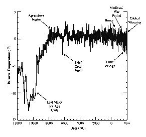
Figure 10.2. Temperatures from 12,000 BC to the present, estimated from Greenland ice measurements of oxygen isotopes.
On this plot, global warming looks small – it is only the slight upturn in the last tiny part of the curve on the rightmost side, nearly invisible in the clutter of data. But remember, it is not the present 2oF warming that concerns us, but the potential of a future 10oF warming. Look at the region marked “Little Ice Age.” It shows as a slight dip, about 1 or 2oF below the level set in the previous thousand years. There is also a “Brief Cold Spell” at about 6000 BC; we don’t understand the cause.
The most dramatic thing on this plot was the period of extreme cold that started beyond the left side of the plot and suddenly ended about 9000 BC. That was the last ice age. Although it doesn’t show on the plot, it had started about for about 80,000 years earlier. That’s much longer than the time that expired since it ended. The temperature was more than 10oF colder than the present. That cold period makes the Little Ice Age look tiny.
Big ice ages are known to return in a regular way. The pattern is this: about 80-90,000 years of extreme cold, followed by a short 10-20,000 year “interglacial” warm period. Agriculture was invented at the beginning of the current warm period, as indicated on Figure 10.2. All of civilization was based on agriculture because efficient production of food is what allows a minority to provide for the sustenance of the majority, and that means there will be food for merchants, artists, and even physics professors.
The fact that the big ice ages recur scared some people in the late 1940s, when dropping temperature made people fear that a big ice age was about to start. Some scientists speculated that the cooling might have been triggered by nuclear bomb tests polluting the atmosphere. (The United States and the Soviet Union ended atmospheric testing in 1963; France continued until 1974, and China ended in 1990. Linus Pauling won the Nobel Peace Prize for his role in bring about this cessation.)
I was in elementary school at the time, and one of our textbooks had a drawing of the consequences to New York City, with 1000-foot glaciers toppling skyscrapers. The figure on the pdf version shows a similar image that appeared on the cover of Amazing Stories magazine. It shows the Woolworth Building in New York being toppled by a returning glacier.
To the relief of many people, temperatures began to rise again after 1970. The ice age was not imminent. Even though the cooling ended, no scientist today believes that the nuclear tests were at fault. Correlation does not imply causality. Many experts now attribute the brief cooling spell to an unusual number of volcanic eruptions that took place during those decades and spewed dust high into the atmosphere. Such material tends to reflect sunlight and thereby reduce the insolation—the solar energy reaching the ground. Once the dust settled and the volcanic activity ceased, the Earth began to warm again.
The rise in temperature continued, and now we are worried about warming. Is this a continuation of the prior trend, the finale to the Little Ice Age? Or is it the beginning of something more ominous? Our now deeper understanding of climate leads most scientists today to believe the latter. We’ll now discuss how the burning of fossil fuels could be the cause of global warming. It is wise, however, to retain some humility, and to recognize that even a theory that explains what is happening may not be correct.
Carbon dioxide
Carbon dioxide is created whenever carbon is burned. The chemical symbol for carbon dioxide is CO2. The C stands for carbon, and the O2 stands for two molecules of oxygen. (That’s why it’s called dioxide; the di means two.) Burn carbon in oxygen, and you release energy and make CO2. We can separate the carbon dioxide back into its components, but only by putting back in the energy we took out. If we’ve used the energy—for example, to make electricity—we are stuck with the CO2.
Carbon dioxide is a tiny constituent of the atmosphere, only 0.038%. Oxygen, in contrast, is about 21%. But CO2 is enormously important for life. Virtually all of the carbon in plants, the source of our food, comes from this tiny amount in the air. Plants use energy from sunlight to combine CO2 with water to manufacture hydrocarbons such as sugar and starch, in a process called photosynthesis. As their name suggests, hydrocarbons are mostly hydrogen and carbon. Hydrocarbons are the building blocks of our food and fuel. Photosynthesis also releases oxygen into the atmosphere, extracted from water (H2O). When we breathe in oxygen and combine it with food, we get back the energy that the plants absorbed from sunlight and remake the CO2.
Scientists traditionally write 0.038% as 0.000380 = 380 parts per million = 380 ppm. Figure 10.3 below shows how the level of CO2 in the atmosphere has changed over the past millennium. Note that the amount was pretty constant from AD 800 until the late 1800s, at a level of 280 ppm. In the last century it has shot up to 380 ppm—an increase of 36%, due to increased burning of coal, oil, and natural gas; some of the rise came from the extensive burning of rainforests to clear the land for farms. If we continue to burn fossil fuels, we expect the carbon dioxide to keep rising.

Figure 10.3. Carbon dioxide in the atmosphere from 800 AD to the present in ppm (parts per million). The sudden 36% rise in the past 100 years is due primarily to the burning of fossil fuels and the clearing of rainforests.
If you see this plot elsewhere, it usually has a suppressed zero, so the y-axis starts at 260 ppm. I don't do that here because it makes it harder to see that the increase in the last century has been about 36%. It’s the recent rise that concerns people. Other measurements (not shown) tell us that the carbon dioxide level now is higher than it has been at any time in the last 20 million years. That fact is not disputed; it is astonishing but not surprising. We know how much carbon we are burning, and that is plenty to account for the increase. (Some of the CO2 dissolves in the oceans, making them more acid, and some is taken up by increased biomass.)
Look at Figure 10.3 again. Here is a summary of what the plot says: for about 800 years, the carbon dioxide in the atmosphere was pretty steady at about 280 parts per million (ppm), i.e. it made up 0.000280 of the atmosphere. Then, sometime after 1800, it began to go up, as a result of the increased use of fossil fuels. We used coal for heating and railroads; then we used “coal gas” to light streets and homes. Then oil was discovered, and that was used for lighting and heating. The development of the automobile occurred simultaneously with the discovery of even greater oil reserves. (The Rockefeller oil fortune was made even before the automobile.)
Look again now at the thermometer record, Figure 10.1. There is an increase in the CO2 right about the time that the Earth began to warm. Is the CO2 responsible? The IPCC says it is very likely that the CO2 is responsible for much of the warming of the past 50 years. The physics relating CO2 to warming is called the greenhouse effect.
The greenhouse effect
The Earth is warmed by light from the Sun. It would just get warmer and warmer if it didn’t have a way to lose that absorbed energy, but it does: infrared emission. If we assume that all the radiation that hits the Earth is absorbed, and is equal to the radiation that the Earth emits, we can calculate the following surprising result: the temperature of the Earth is approximately 1/20 the temperature of the Sun. (For the calculation, see the optional footnote[2].) The Sun has a temperature of 6000 K, and that means the temperature of the Earth should be about 6000/20 = 300 K = 80F. And that’s not too far off.
In the calculation, I assumed that all of the sunlight that hits the Earth is absorbed and turned into heat, but in fact only 60% is absorbed; the rest is reflected. (The reflected amount is called the Earth’s albedo.) When we do the calculation with more care, we find that the temperature of the Earth should actually be about 26oF, well below freezing. If that were true, the oceans would be frozen, and life as we know it could not exist on Earth. But it isn’t that cold; the average temperature is about 57oF (see Figure 10.1 again). The extra warmth comes from something called the greenhouse effect, illustrated in the diagram on the next page.
Sunlight hits the Earth, the Earth gets warm, and it emits IR (infrared) radiation. But, as you can see in the diagram, most of that radiation does not go directly to space, but is absorbed by the atmosphere. That’s because water vapor (H2O) and carbon dioxide (CO2) are effective absorbers of IR. The atmosphere gets warm and it radiates its own IR; half of that goes to space and half comes back to Earth. So the Earth is warmed both by the Sun and by the atmosphere. That’s what warms the Earth back up to a liveable temperature.
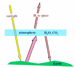
Figure 10.4. The simple Greenhouse Effect.
A similar thing happens in a garden greenhouse. Sunlight comes through the glass, warms the soil; the soil emits IR, but the IR cannot escape through the greenhouse glass. So the inside gets warmer. That’s why this phenomenon is called the greenhouse effect. These days, more people have experience with this same effect in automobiles in parking lots. Perhaps a more up-to-date name for the phenomenon (at least in the U.S.) would be “the car-in-the-parking-lot effect.”
The greenhouse diagram Figure 10.4 shows all the IR from the Earth being absorbed by the atmosphere, but that was an exaggeration. Some leaks through, so the greenhouse warming is not as much as it would otherwise be. That is shown in the more accurate diagram (although a bit more complex), Figure 10.5 below.
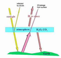
Figure 10.5. The Greenhouse Effect showing leakage and clouds.
Notice that some sunlight is reflected from clouds, and some of the IR radiation from the Earth leaks directly to space, and is not reflected back. The net result is that the Earth is a bit cooler than it would otherwise be – and the average world temperature settles down to about 57 oF on average.
Enhancing the greenhouse effect
If we would like to warm up the surface a bit more, all we have to do it make the atmospheric blanket a little more effective by stopping the leakage of IR. We can do this by adding a gas to the atmosphere that absorbs IR. Then less will leak out, the blanket will be more effective, more IR will be radiated back to the surface of the Earth, and the surface of the Earth will get warmer.
That is exactly what we are doing, although not completely on purpose. CO2 is a good absorber of IR, and it tends to plug the leakage in the atmospheric blanket. The effect of the CO2 is amplified by the fact that a little bit of warming makes more water evaporate from oceans and damp soil. Water (H–2O) also helps plug the leaky blanket; that’s why it is labeled in the diagram along with CO2. A little CO2 causes a little warming; that makes H–2O evaporate, and that also causes warming; the total is about twice what you would get without the H–2O. This total warming is believed to account for the 1oF warming of the Earth that we experienced in the last 50 years.
Now for some more uncertainity. If CO2 leads to more water in the atmosphere, then maybe that would increase the number of clouds. Clouds reflect sunlight, so that could cause cooling! It’s hard to know, because we have not succeeded in inventing a good way to calculate cloud cover. In fact, it is the possibility that clouds might cancel most of the greenhouse increase that led the IPCC to be cautious in its analysis. It is the uncertainty in cloud increase that led them to conclude that they can be only “90%” confident that the warming of the previous 50 years (1957-2007) was caused, at least in part, by humans.
The Hyperbole
Once again, I emphasize that there is a consensus among scientists about global warming. It is represented by the IPCC reports. The 2007 report state that it is 90% likely that humans are responsible for at least some of the 1oF observed global warming of the previous 50 years, that is, the warming since 1957. The effect is real, and currently small. As I said previously, the real concern is that it is expected (with a 90% probability) to grow enormously over the next 50 years.
Small effects tend not to excite the public. If the threat isn’t imminent and obvious, can’t we put off our worry until later? The answer to this question is no, because carbon dioxide tends to stay in the atmosphere a very long time. Even though some dissolves in the oceans immediately, the rest is thought to remain in the air for a thousand years or more. Whatever harm we are doing now will last.
Nevertheless, the public did not pay much attention until advocates of action exaggerated the evidence. They looked over recent climate records, picked everything that was bad, ignored those things that were good, and attributed all the bad effects to global warming. This approach, called “cherry picking” (pick only the impressive cherries and tell people that they are representative of the whole crop) can be politically effective in the short term, but it runs the risk of an eventual backlash. The public may eventually decide that scientists exaggerated, or lied, and they lose trust in science.
In this book I want to give an accurate picture of what is really known. I assume you are interested so I don’t have to exaggerate. To cover the story accurately means that I have to point out not only the facts (such as the temperature records), but lots of things that you may have been told are true, but aren’t. As we go through this list, please remind yourself that the fact that so many of the claims about warming are false does not mean that warming is absent. It just means that the effect so far has been subtle, not as dramatic as some people portray.
The IPCC bases its conclusions about warming on two main effects: the thermometer records, and the melting of the ice pack in the Arctic. Let’s now look at some of the things that are popularly attributed to global warming, examples that got the public excited, but which are really just cases of cherry picking.
Hurricane Katrina
You will hear it said that the devastating “category 5” (the most intense kind) storm that destroyed much of New Orleans in 2005, Hurricane Katrina, is an consequence of global warming, and that as additional warming proceeds, we can expect “many more Katrinas.”
In fact, Hurricane Katrina was not a category 5 storm when it hit New Orleans; it was only category 3, a far weaker kind. It is widely called a category 5 storm because it was strong when out at sea, but not when it hit the city. In fact, any medium-sized (category 3) hurricane that hit New Orleans any time in the last 40 years was likely to destroy the city. The vulnerability came from the fact that much of New Orleans was built on land that was below sea level, and the dikes used to hold back the sea were poorly designed, poorly built, and poorly maintained. But New Orleans was a small target, and fewer than two hurricanes each year hit the United States, so it was not surprising that the city was missed – until 2005. The destruction of New Orleans is not an indicator of any change over the past 40 years; it only illustrates that unlikely events (a category 3 storm hitting the small target) do happen if you wait long enough.
You will sometimes hear news reporters (and even scientists) state that both the number and the intensity of hurricanes has increased in recent decades, and that this increase is due to global warming. In fact, the number of hurricanes probably has not been increasing. The IPCC does not claim they have, and that’s the consensus report. It is true that more hurricanes are being discovered now than in previous years, but that is likely due to the fact that we now use satellites and automatic reporting systems on sea buoys to report wind velocities far out at sea.[3] More reported hurricanes does not mean that there are actually more hurricanes; it may mean that we are just better at looking.
For an unbiased look at hurricane rates, we can use a standard scientific trick: look at the number of hurricanes that hit a region such as the US coastline. When a hurricane hits there, it is always noticed, whether it took place in 1900 (when there were no satellites) or now. A plot of such hurricanes is shown below, based on a report by Marlo Lewis (Competitive Enterprise Institute) using data from the National Hurricane Center.
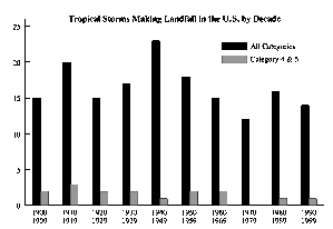
Figure 10.6. Hurricanes that hit the U.S.
The tall bars show the number of hurricanes each decade that hit the United States coast; note that about 15 hit each 10 years, or about 1.5 each year. The small bars show the number of intense ones that hit (categories 4 & 5); they average one or two per decade. There is a slight trend downwards for both kinds of storms, but it is not statistically significant. What can be said is that there is certainly no evidence that hurricanes hitting the US are increasing, either in total number or in intensity. Yes, there are more hurricanes observed every year, but that is mostly an artifact of our improving ability to detect storms deep at sea where they previously would have been missed.
Remember: there is good evidence that the climate is warming, with a human contribution (so far) of about 1oF. Would you expect that 1oF warming to cause an increase in violent storms? Maybe, maybe not; there are good arguments on both sides. One argument is that the increased energy (from the higher heat content) provides energy for storms. The other argument is that warming is expected to be greater in the arctic (sea ice has been decreasing north of Canada), but the effect of that is to reduce the temperature differences between north and south, and by evening out the temperature, storms are less likely to grow; that’s because hurricanes feed off temperature differences.
Will storms increase or decrease? We don’t know. That’s why the IPCC suggests that storms might increase, but makes no definitive prediction. Those who claim that increased hurricanes are evidence for global warming are not being careful, nor scientific. But they do get the attention of the public, particularly after the tragedy of Katrina.
What about other kinds of storms, such as tornadoes? In his movie, “An Inconvenient Truth”, Al Gore claims that not only are hurricanes increasing (a fact we just showed to be in great doubt) but also that tornadoes are increasing.
Tornadoes
Every year the US government publishes a plot of strong to violent tornado activity in the United States. The plot for years 1950 through 2006 is shown below.
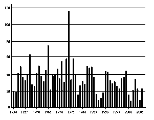
Figure 10.7. Strong to violent tornadoes in the U.S.
This plot shows that there is no increase in the number of tornadoes vs. time. In fact, there has been a statistically significant decrease; look at the total number of storms on the left side of the plot, compared to those on the right side. So why does Al Gore say the storms are increasing? He doesn’t say (he presents no data, only his conclusion) but he might have reached that conclusion if he say a plot of total number of tornadoes, including those that hit never touch the ground. Thanks to radar, we now detect many more storms than we did in the past, so such an increase would really be an observational bias. Figure 10.7 shows that tornadoes that do damage to the US are decreasing; those are the ones shown in the plot. It is even possible that this decrease could be due to global warming, since such warming decreases the temperature between north and south, and might weaken the gradient responsible for violent storms. We don’t know. But it does not make good propaganda to suggest that tornadoes are decreasing from global warming; it might make some people mistakenly think that global warming is good.
Global warming is supposed to reduce the gradient of temperatures. One of the bits of evidence that the IPCC uses in support of global warming is the melting of ice in the Arctic Ocean. The disappearance of sea ice is a real effect (although it has not led yet to deaths of polar bears). The melting of Alaska is real too.
Alaska
Alaska is melting, literally. Much of Alaska is built on frozen ground called permafrost, a soil condition that results when the yearly temperature averages below freezing. But across most of the state, that criterion is just barely met, by a few degrees Fahrenheit. A small bit of warming can make a big difference.
When I drove Alaska's Highway 4 in the summer of 2003, the landscape looked flat but the ride felt like I was on rolling hills. The road undulated up and down, thanks to partially melted permafrost; costly road repairs had to be done every summer. Along the sides were “drunken trees” (a local term), leaning on each other's shoulders like thin, inebriated giants, their shallow roots loosened by melting soil. There were also drunken homes, leaning and sinking into the ground, and sunken meadows, 10 feet lower than the surrounding forest. Sunken meadows result when trees are cleared and a little bit of extra warmth reaches the ground in the form of direct sunlight.
The ecology itself seems to have a meltdown when temperatures rise above 32°F. Warm weather in Alaska encouraged an infestation of bark beetles that killed 4 million acres of spruce forest. This has been called the greatest epidemic of insect-caused tree mortality ever recorded in North America.
Alaska is frequently cited as the early-warning evidence that disastrous global warming is on its way. Now look at Figure 10.8, the actual temperature record published by the respected Alaska Climate Research Center, an institute I visited during my 2003 trip.
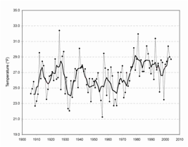
Figure 10.8. Alaska temperature record, 1906 to 2005, measured in Fairbanks. Dots
show yearly average; the dark line shows the average over several years.
The first thing to note on the plot is that the temperature averages between 25 and 29oF. That’s below freezing – and that’s why the ground is frozen into permafrost at Fairbanks. If the average temperature rises above freezing, then the permafrost melts. That hasn’t yet happened at most of Fairbanks (where which is north of much of the distressed region), but even at this city there are pockets of land in which the temperature is a bit higher.
The figure also shows that the warming of Alaska is real and documented. Look at the left side of the chart, and note that it tends to average about 26oF. Now look at the right side, and you’ll see it is a bit warmer, averaging about 28oF, two degrees warmer. A careful mathematical average verifies these results. Alaska has warmed about 2oF over the 20th century. That’s about the same as for the entire U.S. shown in Figure 10.1.
Why is a 2oF change so bad? The data above were taken in Fairbanks, and if you go a few hundred miles south, the average temperature is a bit warmer. That is where the greatest damage is being done – in the regions of Alaska where the average temperature used to be just below 32oF, but now is just above. Your house, your highway, is no longer on solid ground, but on mushy marsh.
Look at Figure 10.8 again, and you may think there is something peculiar. If you had only the data from 1906 to 1975 (cover the rest of the plot) would you have concluded Alaska was warming? Or does it appear to be cooling? Do it and see what you think.
Now cover the left side, and look only at the record from 1980 to the present. Has the climate of Alaska warmed in those past 28 years? It doesn’t seem like it has.
Now look again at the entire plot. Note that the warming appears to have taken place in a very short time, from 1975 to 1980. Before 1975 it was fairly level averging 26oF, and on the right side it was also level, averaging 28oF.
Compare this plot to the global-warming graph Figure 10. The patterns of warming in Alaska and on the Earth as a whole seem quite different. Compare the Alaska plot to the increase in CO2 (Figure 10.3). Most of CO2 increase, and most of the global warming (Fig. 10.1) has taken place in the past 28 years, from 1980 until now. Yet the temperature of Alaska (Fig. 10. 8) has been remarkably stable in that same period.
Do the strange pattern, and the fact that it doesn’t seem to follow the global trend of carbon dioxide, show that the melting of Alaska is not due to global warming? No, not at all. The temperature trends of Alaska could well consist of a rise due to global warming, with a downward fluctuation in the last decade caused by something else. (There have been serious papers suggesting that soot from Chinese coal power plants is responsible; another paper points to the possibility of a decadal El Nino kind of sea variation that takes place naturally in the Arctic Ocean.) However, advocates of action are unlikely to show you this temperature plot, because it raises awkward questions about the cause of the melt. That’s another kind of cherry picking. Show only the data that wows the audience, and avoid anything that seems to contradict the simple picture.
Scientists who are trying to figure out real causes must not let themselves cherry-pick; they have to see all the evidence. That’s why I show it, even though I agree with the IPCC that global warming is real, and very likely caused (at least in part) by humans. And, of course, continued warm weather is just as bad for Alaska as increasing warm weather; once the temperature is above freezing, the ground melts. The problem is not so much that Alaska is getting warmer, but the fact that it is staying warm, after a rise that took place before 1980.
It is also interesting that the Alaska plot seems to suggest that the warming of Alaska was about the same as, or perhaps only slightly greater than, the warming of the whole earth. The data do not yet show evidence for the widely predicted effect that warming in Alaska will be much greater than in the continental U.S.
Antarctica
Antarctica is melting too. The numbers are rather dramatic. Measurements of the ice mass have been accurately achieved from a satellite known as GRACE (you can look it up online) that measures the ice’s gravitational effects on the satellite orbit. They show that the glaciers of Antarctica are losing 36 cubic miles of ice every year! This appears to be a dramatic and worrisome demonstration of the magnitude of global warming.
Remarkably, the appearance does not reflect reality. In year 2000, the IPCC knew that the GRACE satellite measurements were imminent, and so they had scientists calculate how much ice change was expected from global warming. The surprising result was that all the scientists predicted that global warming would increase the ice of Antarctica, not decrease it. The reason for this is not hard to see. Even with 1 or 2 degrees warming, most of Antarctica remains very cold. Loss of ice mass comes not from melting but from calving, the breaking off of ice as it flows to the sea. With additional warming, the main effect (according to the calculations) was additional evaporation from the sea; warm weather evaporates water. When this water vapor drifts over the continent of Antarctica, it results in added snow, which compresses to ice – and the glaciers were expected to grow. So global warming was predicted to increase the Antarctic ice mass, not decrease it. Had they seen the ice mass increase, scientists might have concluded that their prediction was verified, and that the increase was additional evidence for global warming.
The opposite is what was observed. Does this disagree with the global warming picture? Yes. Does it disprove global warming? No – the temperature evidence is very strong. It does show that our current understanding of the warming is not good enough even to predict huge ice changes in Antarctica.
What about the Arctic ocean? Does it mean that we have to be cautious about interpreting reduced ice in that ocean as evidence for global warming? Yes.
What’s the bottom line? Answer: global warming is observed to be about 2oF since the late 1880s. Since 1957, some (maybe most) of the 1oF rise is very likely due to humans. The evidence is strong, but the rise is not so great (yet) that it can be easily seen in individual locations, such as Alaska or Antarctica. Rather, it is the totality of the evidence, particularly the temperature evidence that gives us cause for concern. Don’t attribute a hot day (or reduced Antarctic ice) to global warming; the effect is more subtle. But it is real, and it is very likely that at least some of the warming of the past 50 years has been caused by humans, primarily from our burning of fossil fuels.
Every now and then you’ll hear a news report about a big chunk of ice that breaks free from Antarctica. That will usually accompanied by a scientists stating that it could be evidence for global warming. Indeed it could be. Or maybe not. Increases in ice (and parts of Antarctica are growing glaciers) are not as dramatic, and don’t make the news. But given the poor understanding we have of the region, any change in conditions will often be accompanied by a statement that the change could be do to global warming. And it could be. Or maybe not.
Fluctuations
There is another kind of exaggeration that allows proponents to attribute every bad bit of weather to human-caused global warming, even cold weather, based on the argument that even if the warming is small, the added heat will increase the variability of climate. This effect is suggested in some of the computer-based climate models, but it is certainly not established to be true. In fact, fluctuations might decrease due to the reduced temperature difference between latitudes as the northern regions heat more than the equator.
The IPCC says that some or most of the 1oF temperature rise in the last 50 years is due to humans. Of course, temperature on any given day may vary by 20oF or more. It is extremely unlikely that tomorrow’s weather will be within 1oF of today’s. So global warming is tough to spot. It is a small effect in the midst of huge fluctuations. The only way you can even detect global warming is by making careful and extensive averages of lots of data.
Climate too varies enormously. Fluctuations (perhaps due to volcanoes) are probably responsible for the cooling in the 1950s that led to the fear of a returning ice age; nobody thinks that was caused by global warming. Weather is famous for being variable On any given day, the temperature is unlikely to be at the average for that date. Look again at the temperature peak that took place in 1998 – in Figure 10.1. That high caused a great deal of consternation in the following years. Look at the variations up and down in that plot. Those variations are what make it hard to detect global warming, and they can easily be played by politicians (and well-meaning scientists) to make the public worry about global warming. Local variations are much larger than those seen in Fig. 10.1, since that figure represents an average over hundreds of locations. Measurements taken at one location, such as the data for Fairbanks (Fig. 10.8) show even larger fluctuations. Note that about year 2000, Fairbanks had the coldest average temperature it had experienced for 35 years! But that is just a fluctuation, not an indication that Alaska is cooling; in fact, the running average shown in Fig. 10.8 illustrates that Alaska has indeed warmed.
Paleoclimate
By digging deep into glaciers, and by looking at sedimentary
rock (laid down every year on the ocean floor primarily from coccoliths –
the remains of microscopic animals), we can detect evidence of huge climate
change in the past. An example of
this is shown in the plot below, adapted from one shown by Al Gore in his
movie/book An Inconvenient Truth.
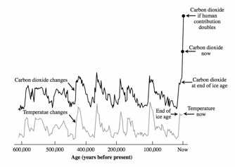
Figure 10.9. Climate (and carbon dioxide) for the past 600,000 years.
First look at the temperature changes (lower curve). There is no scale on the plot, but the swings up and down probably about to changes of 10 to 15 oF. The low regions are the ice ages, and the high points are the warm interglacials. Note that the very end (on the right) is the current warm interglacial, the brief (on this plot) period when farming and civilization developed. It is only 12,000 years in duration (so far), and on a plot that covers 600,000 years, that doesn’t take much space. Note that the warm interglacials take place roughly every 100,000 years. This is the cycle of the big ice ages that I spoke of earlier. They return in a fairly regular way. These cycles are believed to be due to changes in the orbit of the Earth as it is perturbed by Venus, Jupiter, and other planets. The orbital explanation is generally referred to as the Milankovitch Theory.[4]
Now look at the upper curve, which shows the relative amounts of carbon dioxide in the atmosphere. That varies too, in apparent lock-step with the temperature. In his movie, Al Gore gives the impression that this verifies that CO2 causes climate change. In fact, even though that is the conclusion that most people watching the movie come away with, he never actually says that. He says that the situation is “complicated.” And indeed it is. He summarizes the plot by saying that every time there is a lot of carbon dioxide, it is warm, and whenever the carbon dioxide is low, it is cool.
But most geophysicists believe that it is the temperature that is causing the CO2 to change, not the other way around. Most of the CO2 in the biosphere is actually dissolved in ocean water. When the water warms, the CO2 is driven out; gas doesn’t dissolve as well in warmer water. The fact that warming is causing the CO2 change is verified by other measurements that indicate that the CO2 changes lag the temperature changes by about 800 years. In other words, the temperature changes first, and then it takes 800 years for the CO2 to finish coming out of the ocean. That’s a reasonable number, because we know that deep ocean water takes about that long before it works its way to the surface, where the CO2 can escape.
Something else in the plot suggests that the CO2 is a result of warming, not the other way around. Look at the recent CO2 rise, at the right side of the plot. The recent increase is about as much as the increases at the ends of the ice ages. If the CO2 were causing the warming, we would expect to see a 10 to 15oF warming, not the 1 to 2oF warming that we have actually experienced.
Some scientists disagree, and think CO2 may have indeed been responsible. The situation is “complicated”. Perhaps the 800-year lag has been misinterpreted. There really is a reasonable controversy here. What you really need to know is that the paleoclimate plot, Figure 10.9, is not clear and incontrovertible evidence that CO2 has driven climate in the past. Even so, you should not conclude that therefore the evidence for CO2 greenhouse warming is weak. It just cannot be based on this plot. The evidence is based on the observed increase in temperature (1oF in the past 50 years), plus our understanding of the likely effects of CO2 on greenhouse warming.
“Global Warming” vs
“Human-caused Global Warming”
Another common problem in the news is the semantic confusion between the terms “global warming” and “human-caused global warming.” They are often taken to be synonymous. But remember that the IPCC concludes only that some or most of the warming since 1957 was very likely (90% confidence) caused by humans. They do not conclude that the warming from 1850 to 1957 was human, because they can’t rule out the possibility that it was a natural recovery from the Little Ice Age, perhaps caused by changes in the intensity of the Sun. It is important to recognize that when a politician or scientist claims that the warming prior to 1957 is human caused, that they are giving their own conclusion, and not representing the IPCC scientific consensus. They may be right, but maybe not.
Is there global warming? Yes. Is it caused by humans? Well, it is very likely that some, maybe most of the warming of the past 50 years was caused by humans. There is a 10% chance (according to the IPCC) that it wasn’t.
Can we stop global warming?
Humans have very likely contributed to global warming, and that suggests that the worst effects are still ahead of us. What can we do? There are lots of feel-good measures; we can use less gasoline, or perhaps turn down our thermostats to save heating fuel. Such measures are so dramatically short of what is needed, that there is a danger that people who do such things think they are leading the way to a real solution. In this section, I’ll explain why the problem is so hard to solve.
Figure 10.10 below shows the energy use per person (y-axis), plotted against the income per person (x-axis) for various countries. Several points are plotted for each country to show how the values changed from 1982 to 2004. Note that the US uses more energy per person than any of the other major country. This is in part because the United States is spread out geographically, and in part because energy in the US has been very cheap and so we have not had to conserve. Australia is high for similar reasons. Note also that the US has not increased its energy use per person very much in recent years. The curve for Russia actually went down, as its economy collapsed in the late 1980s; the hook near the bottom of the Russia curve shows some recovery.
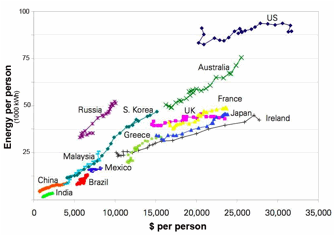
Figure 10.10. Energy use vs. income, per person, for various countries
Look at the general trend in this plot. Every country is near the diagonal, meaning that every country seems to be within a factor of two of using 25 megawatt-hours of energy use for every $10,000 of income. We don’t know why this is true. Some people speculate that energy is necessary for income, although the relatively unchanged energy use in the US for the last 20 years, while the economy grew, shows that isn’t a strict law of economics. Others suggest that wealthy people can afford to use more energy, since they value light, heat, high tech goods, and travel, so the energy use might be a consequence rather than a cause.
What makes the curve worrisome is the fact that most of the population of the world is at the lower left corner: poor in both energy and dollars. As poor as they are, these economies are growing rapidly. In recent years, the Chinese gross domestic product (or GDP, the total sum of goods and services) has been growing at an astonishing rate of 10% per year. Look at the curve for China, and although the numbers are small, you can still see that the $ per person has more than tripled over the past 20 years! India is also showing amazing growth; for it, the $ per person has doubled. That’s why these countries are called developing nations! Most caring people look forward to the end of poverty in these countries. But if they follow the general trend (and so far they seem to be doing that), then the energy use of the world will grow enormously in the coming years.
Will there be enough energy available to allow these countries to stay on the trend line? Many people think we are running out of fossil fuels, but that isn’t really true; what we are running out of is cheap oil. We will not run out of expensive oil for a long time. Let’s begin by looking at the price at which oil is sold on the world market. That is shown in Figure 10.11 below.
Figure 10.11. Price of oil (per barrel) adjusted for inflation
This plot shows the price of oil from 1970 until 2006, plotted in “constant dollars” (that is, it is adjusted for inflation; the fact that a dollar in 1970 was worth about five times as much as a dollar in 1970).
This plot shows the cost to buy oil. The price to drill it is quite different. In Saudi Arabia, oil can be drilled for only $3 per barrel; when sold at $100 per barrel, the profit is enormous. But in some other places, oil costs $20 or more to drill. The high price of oil right now is determined more by the limited supply. The recent growth in the economy of China has made a demand on oil that the world’s producers can’t match, and so the price has risen.
Now take a look at the complicated chart (Figure 10.12) on the next page. It is worth studying, because it gives important insights for the future of oil for the next few decades.
Here’s the way to read the plot. The horizontal axis represents the amount of oil available; the vertical shows the cost to obtain that oil. (It isn’t the consumer price to buy it but the oil company cost to get it from the ground.) The rectangle in the lower left corner labeled “Already produced” shows that we have already produced, in the history of the world, about 1000 billion barrels of oil (horizontal axis) at a cost that ranged from $0 to $20 per barrel (vertical axis). The arrow points to the amount of oil we expect we will need by 2030. That can still be provided by OPEC.
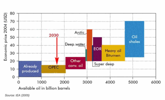
Figure 10.12. Availability of oil as a function of price
In the olden days (1990s), people assumed that nobody would pay more than $20 per barrel. At that price, there is only a tiny bit more than 2000 barrels total – only about twice what we have already pumped. That’s why people thought we would run out by 2050. But oil prices have now risen to $100 per barrel and above. At such high prices, all of the oil shown on the plot is available. That’s why I say we are not running out of oil, but only out of cheap oil. That’s actually bad news for the environment; there is lots of carbon in all that oil.
It is worth looking at some of the blocks in the plot. The block titled OPEC refers to the oil available from the monopoly (technically a cartel) known as the Organization of Petroleum Exporting Countries. These countries get together to decide on the price to sell oil; they do this to avoid competition that might otherwise lower the price. The next block is “other conventional oil”, including standard drilling in Texas and around the world. Then we get to deep water (with oil rigs that float above) and the arctic – both more expensive to recover. Heavy oil refers to places such as Alberta in Canada where the oil is thick, almost tar-like, and can be extracted only by sending hot steam down into the ground to heat the oil and make it less viscous. The price of oil is now sufficiently high that this is currently being done. In fact, the recent rise in the value of the Canadian dollar is mostly due to Canada’s new oil riches. The final rectangle on the plot is for oil shale; there is much of this in the US, but to extract it requires heating the rock above 600 oF, a temperature at which the heavy bitumen molecules break down into lighter and more fluid ones.
Fossil fuel resources
When we consider fossil fuels other than oil, the situation is even more dramatic. Coal and natural gas appear to be abundant, particularly in the countries that will need them. The table below shows the fossil fuel reserves for several key countries. The amounts are described in billions of barrels of “oil equivalent.” So coal and natural gas are given in terms of how many barrels of oil it would take to give a similar amount of energy. Oil from shale is the most expensive of all, but as you can see in Fig. 10.12, it can be recovered at prices well below $100 per barrel.
Carefully examine the table. Mark the page so you can find it easily, because you will probably want to refer back when you discuss the world energy situation. Note that the US has low reserves of oil, but enormous reserves of coal. In fact, the fossil reserves of the US are greater than that of any other country; if you include oil shale, the US is enormously far ahead. Other large countries with big populations (and these are the ones that will be using lots of energy in the future) include Russia, India, and China, and they are all near the top of the list.
From Fig. 10.12, you see that the total amount of OPEC oil available for the future is about 1000 billion barrels. From the table, you see that the US has 3737 billion barrels of oil equivalent – 3.7 times as much as OPEC, but in the form of coal and shale, not liquid oil.
So we are not about to run out of fossil fuels, only out of cheap oil.
|
Fossil fuel reserves (billions of
barrels of oil equivalent) |
|
|
||||
|
|
oil |
coal |
natural
gas |
TOTAL |
oil shale |
TOTAL with shale |
|
US |
21 |
1184 |
32 |
1237 |
2500 |
3737 |
|
Russia |
60 |
754 |
280 |
1094 |
250 |
1344 |
|
Australia |
130 |
377 |
821 |
1328 |
|
1328 |
|
India |
5 |
444 |
853 |
1302 |
|
1302 |
|
China |
48 |
550 |
14 |
612 |
|
612 |
|
Iran |
136 |
|
157 |
293 |
|
293 |
|
Saudi Arabia |
260 |
|
0 |
260 |
|
260 |
|
Canada |
179 |
32 |
9 |
220 |
|
220 |
|
Qatar |
15 |
|
152 |
167 |
|
167 |
|
Brazil |
8 |
49 |
2 |
59 |
80 |
139 |
|
Iraq |
115 |
|
18 |
133 |
|
133 |
|
UAE |
97 |
|
35 |
132 |
|
132 |
|
Kuwait |
99 |
|
9 |
108 |
|
108 |
|
Venezuela |
80 |
2 |
25 |
107 |
|
107 |
|
Mexico |
12 |
17 |
5 |
34 |
100 |
234 |
Part of the reason that we import so much oil is that we can’t burn coal in our autos. Or can we? Think about the history of the locomotive. In the early US, locomotives ran on biofuels: the trees that grew along the tracks. As these were used up, and coal discoveries were made in Pennsylvania, they converted the engines to burn coal. Nobody worried about the fact that coal creates about twice as much CO2 as oil, because nobody was warring about global warming. Eventually these coal burners were replaces by diesel engines, using diesel fuel, a kind of gasoline. Diesel was much easier to use, because it left no residue, unlike coal which left ash behind.
In fact, coal can be used to manufacture oil, including diesel fuel and gasoline, through chemistry.
Fisher-Tropsch: coal and water make oil
Coal can be turned into diesel fuel by a chemical factory known as a Fisher-Tropsch plant. The carbon in coal (C) is combined with water (H2O) to make oil (long chains of CH2) and CO gas. The CO (carbon monoxide) can be burned as fuel to run an electric generator. Fisher-Tropsch plants were developed by countries that had lots of coal but no access to oil; these include Germany during World War II, and South Africa when they were denied oil imports during the apartheid era. It was not used in the rest of the world because oil has been cheap. Oil from a Fischer-Tropsch plant costs between $40 and $60 per barrel. When the cost of oil gets above this, then oil from coal becomes economical.
We are running out of oil in the U.S., and paying exorbitant prices for oil from OPEC, so why don’t we start making our own oil from our abundant (and cheap) coal?
The primary reason seems to be the cost of building a plant. Estimates vary, but numbers I have heard range from $100 million to $1 billion per chemical factory. That could be a good investment, but it could also be a bad one – if the price of oil drops. And you can see from Figure 10.12 that there are other sources of oil available at lower prices. If OPEC decided to lower prices back to $40 per barrel, it could make a billion dollar Fisher-Tropsch investment worthless. Some investors had decided to go ahead and build Fisher-Tropsch plants, but only if the US Government will promise to buy oil at a minimum price of about $60 per barrel, even if OPEC drops the price below this.
To many people, the greater concern is the CO2 production that would come from exploiting these coal resources.
Energys independence
Aside from price, there is another enormous pressure driving us to greater use of coal. That is “energy independence.” Right now, over half of the oil used in the U.S. is imported. The demand for such oil drives up the price, and that funds countries such as Iran that support terrorists. Some people say that our “love affair” with oil means we are funding both sides of the war on terror.
The desire for energy independence – reducing our imports and operating our economy only our U.S. reserves, is powerful. But if we move in that direction we will use more and more coal (it is cheaper than oil shale), and coal produces about twice as much CO2 as does oil, for the same energy. That means that there is a conflict between the desire to reduce CO2 and our wish for energy independence.
Kyoto
Even if human-caused global warming is not certain, the consensus of the IPCC indicates that the risk is substantial. Many experts conclude that we must exercise “risk management”, even before the danger is proven to be 100% real.
What can we do? Many people suggest that we need to cut back strongly on our CO2 emissions. In 1998, then Vice President Al Gore signed a proposed amendment to a treaty called the United Nations Framework Convention on Climate Change, in Kyoto Japan. Ever since, this document has been referred to variously as the Kyoto Protocol, Kyoto treaty, Kyoto accord, or simply Kyoto. Senate ratification of the treaty would commit the United States to a reduction in carbon dioxide emissions to 7% below our 1990 level. Because emissions have grown since 1990, the actual cut required works out to about 29% of the levels expected in 2010.
The treaty has been ratified by 164 countries—almost the entire world—but not by the United States, to the embarrassment of many US citizens. In fact, it was not even submitted for ratification by Presidents Clinton or Bush, presumably because they knew it would fail to pass in the Senate.
The main objection to the Kyoto accord is that it places no limits whatsoever on developing countries such as China and India. All of the reductions are supposed to come from the developed world, not the poor. Take a look at Figure 10.13 below. It shows various groups of countries, including Western Europe, Eastern Europe (including Russia), but the US is not grouped; it stands by itself. The US dumps more CO2 into the atmosphere than all of Western Europe. That’s why many people demand that the U.S. cut back.
Based on numbers such as these, we can indeed conclude that the US was responsible for at least some of the 1°F temperature rise of the past 50 years. We will very likely not be responsible for the predicted 3°F to 12°F temperature rise of the next century, however. The main culprits for that increase will be India, China, and the rest of the developing world. The major increases are now coming from the developing countries, predominantly China and India. In 2006, the CO2 production of China surpassed that of the United States. Look at the plot, and imagine that the U.S. reduces its use down to the 1990 level. That would be about 0.2 billion tons of carbon. Now assume that we stay there, but that the developing countries continue their growth. They would add in an additional 0.2 billion tons, enough to undo the U.S. cutback, in less than 3 years. If the U.S. keeps its CO2 emissions low, but the developing world continues to develop (in CO2 emissions) then we have delayed the potential global warming by only 3 years, even if the U.S. emissions stay low.
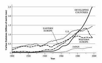
Figure 10.13. CO2 emissions from various countries
Why, then, are so many people so enthusiastic about the Kyoto treaty? Many Kyoto proponents say that the United States must set an example, in the hopes that one day China and India will follow. Opponents say that China and India are certainly going to follow our example, but not in a way that will help. They will develop their economies as rapidly as possible, just as we did, and then, when their people are as wealthy as ours, they will begin to consider controlling their emissions, just as we are now doing. Although the carbon dioxide that they now produce exceeds that of the United States, their production per capita is less than one-fourth that of ours. If you were president of China instead of the United States, would you cut back? With a population that still suffers from poverty, malnutrition, poor health, lack of opportunity, widespread illiteracy and periodic famines, would you slow economic growth in order to keep the temperature from going up a few degrees? Add to this the facts that China has plenty of coal, certainly enough to meet the worst scenarios of the global-warming models, and that it is accelerating its exploitation of that resource.
Many people fear that cutting back on U.S. emission would not persuade the developing countries to follow suit. In fact, one vote has been taken by the U.S. Senate on the Kyoto accord, although not to ratify it. The vote was for the Byrd–Hagel Resolution, and it passed in a very bipartisan 95-to-0 vote. The resolution states that the United States should not ratify Kyoto until the treaty is rewritten to include binding targets and timetables for developing nations. The Senate simply did not trust that our CO2 example would be sufficiently persuasive.
The Kyoto treaty expires in 2012, and negotiations have already begun for the follow-up treaty. The fact that China surpassed the U.S. in CO2 emissions in 2006 has made it easier for opponents to argue that the U.S. is no longer the main problem. Most people believe that there is no easy solution, but that to manage the risk, many different options will have to be used, all at the same time.
Solutions
The discussion seems to suggest that even if the US were to abide by Kyoto, that the growth of the developing world will still result in enormous CO2 increases. Is the situation hopeless? I don’t think so, but unless our methods of reducing CO2 can be afforded by developing countries, they are unlikely to do anything other than delay the predicted warming by only a few years. The emphasis must be on CO2 reductions that can be used by all. By far the easiest is conservation.
Conservation
Ponder the following physics question: How much energy should it take to drive from San Francisco to New York City? The answer, from physics, is surprising. In principle, it could be done with no energy. After all, you can slide across ice effortlessly; the only energy it takes is to overcome friction. What if you eliminated friction? Is any other energy necessary? With an efficient hybrid engine, you can recover the energy used in accelerating a car and put it back into a battery when you slow down. That’s called “regenerative braking”; it uses the motion of the car to turn a generator that charges the battery. Likewise it takes energy to go up a hill, but the same principle can be used to recover the energy when you coast down. The basic conclusion: with better auto design, we can enormously reduce the energy consumption of autos. My Prius already gets 50 miles per gallon; there is not reason why an auto could not achieve 100 mpg or more.
Similarly for heating our homes. The only reason we have to heat them is that energy is lost to the outside world primarily through convection (open or leaky windows, chimneys), and conduction (though glass windows and uninsulated walls and roofs). With good insulation (including double-paned windows), the amount of heat we need can be made tiny. In fact, recent analysis (by the respected firm of McKinsey) has shown that you save money by doing that; the cost of putting in better insulation is recovered in just a few years, and after that, it is pure profit. That makes it one of the best investments you can make; invest your money into insulation, and take as your “interest” in the form of money saved keeping your home warm. And you don’t have to pay taxes on this kind of interest.
Use less energy for the same function; that’s called conservation. Conservation is the easiest way to reduce greenhouse emissions, and because it is the least expensive way to do so, it will be particularly valuable in the developing countries such as China and India since it pays back whatever investment is needed in a short time.
A lot can be said about conservation. It has a bad reputation among consumers because they associate it with discomfort; in the 1970s, President Jimmy Carter encouraged people in winter to live in a cold house (65 oF) and to put on a sweater in order to save energy. But comfortable conservation should be more attractive. Put some insulation in your walls (rather than your bodies), and turn up the thermostat to whatever temperature you want. Save energy by not letting it leak out. And it is a great investment; your return on the money you put into conservation will pay higher interest than a savings account.
Similar principles work to save the energy used to air condition houses in summer. About half of the solar radiation hitting our roofs is in the form of infrared. If you use roofing material that reflects this, then the heating of the home is drastically reduced, and that lowers the energy needed to air condition. And to the human eye which does not see IR, the “cool roofs” can still be a pleasant brown color, or whatever the homeowner wants.
A whole chapter or even a book can be written on comfortable conservation, but we need to discuss other possibilities.
Clean coal
Over half of the electric power in the United States is produced by burning coal and creating CO2. If this CO2 is produced at a central power plant, then in principle it is possible to capture it and store it. This is called Carbon Capture and Storage, or CCS – an acronym you do need to know, since it is already becoming an important national issue. Another related term is sequestration; that refers to the process of pumping the CO2 underground where it is either stored in cavities or dissolved in deep brines (salt water).
According to the IPCC, this process seems to be feasible. Sequestration is already being tried at several locations around the world, although with a different purpose: pumping CO2 into oil wells can help bring up additional oil. There is debate over how safe CCS will be. Will the CO2 really stay there for thousands of years, or will it eventually leak out? The IPCC has written an extensive report on this subject. Most experts believe that if it stays down for a few years, it is very likely to stay down for thousands, and so we will quickly learn how reliable sequestration can be.
When people refer to “clean coal”, CCS is what they mean. The biggest issue may not be whether this can be done, but whether it can be done economically; remember, China has huge coal supplies, and is actively building new plants. In 2007 it built over one new gigawatt plant every week, on average! CCS will make the power cost more, perhaps 50% to 100% more. China may argue that it should not have to pay the premium until its citizens live at Western standards of living. If they do, then perhaps the wealthier countries will have to pay the difference. That could be accomplished through carbon “cap and trade”, a topic we’ll discuss shortly.
The U.S. had a major clean coal demonstration power plant under construction. It was called “FutureGen” and its goal was to show that an efficient and inexpensive clean coal production of electricity with CCS was feasible. The program was cancelled in 2008. Some people think it was a terrible mistake to cancel a demonstration of this essential technology. Others think it was a good idea; the demonstration plant was rushing ahead so fast that it was proving to be expensive, and proponents of CCS worried that it would give a misimpression that clean coal was far more expensive than it need be.
Biofuels
Biofuels are fuels that are made by plants; they include wood, pulp, and liquid fuels such as ethanol that are made from plant products. When these burn they emit CO2, but no more than they took out of the atmosphere when they grew. Therefore they are described as “carbon neutral.” That’s not always true, however, since many fuels require fertilizer and machinery to grow them, and oil to run the tractors; these are often made using fossil fuel. Ethanol made from corn is particularly bad; you use almost as much fossil fuel to make the ethanol as you get in biofuel. In contrast, ethanol made from sugar cane is a good biofuel, provided that you don’t have to cut down a forest in order to clear a growing region. But a new generation of biofuels is under development, using materials such as tall grasses (switchgrass and miscanthus) that require little water, grow fast, and truly are carbon neutral. To use these grasses as liquid fuels, we need to develop methods to convert the cellulose in the plant stalks to ethanol. Ways of doing that are under active development around the world; that is the goal of a large new institute at Berkeley funded by BP.
Some states have already passed legislation requiring that autos use a mixture of gasoline and bio-ethanol, a combination often called “gasohol.” Much of this legislation was passed prior to the discovery that ethanol-based alcohol is not very energy neutral. But with the new crops and new technology, biofuels could make a significant contribution to both CO2 reduction and energy independence.
Nuclear power
There are 104 nuclear power plants in the United States, producing on average about 1 gigawatt of electric power each, and providing about 20% of the US electric power. Construction of new nuclear power plants came to a virtual halt in the United States after the 1986 Three Mile Island accident, although plants that had been under construction were eventually commissioned (such as the Watts Bar plant, in 1996).
The reasons for the halt were fear of accidents, concerns about waste storage, and the high cost of operation. The fears are now being reevaluated, thanks to the recognition that fossil fuels also have risks, and because there are nuclear reactor designs that have little or no accident probability. (Look up “pebble bed reactors” on the web.) Many people think the waste storage issue was exaggerated; I discussed this in Chapter 5. Moreover, the cost of operation of nuclear plants has come down, largely through better management. The “capacity factor” (the fraction of time that a nuclear reactor is actually working and delivering power) was barely above 50% in 1980 and now it is nearly 90%. This has made nuclear power much cheaper than it had been.
Some environmentalists now argue that coal is so bad in its CO2 production, that at least part of our electric power should come from nuclear. China has been building about 2 new nuclear plants each year; France gets about 80% of its power from nuclear reactors; and in the U.S. several companies are applying for licenses to begin construction of new plants.
Wind
The use of wind to generate electric power has recently grown enormously in the United States. In the last four years, the installed capabilities in the US have doubled, from a half percent to one percent of US electric production. That’s a huge change, and it is expected to grow even more. The technology is old but innovative; new wind turbines[5] are quiet and efficient. The biggest fields are being installed in Texas, which has the advantage that the wind is close to the population centers. Right now the growth of this technology appears to be limited by the US limited capability to manufacture the wind turbines.
One problem with wind is that it is irregular, and it may not blow when you most need power. To address this issue people are studying energy storage methods, such as batteries. One of the most practical may turn out to be one of the most surprising: use excess power to compress air, stored underground; when the power is needed, use the compressed air to run another turbine.
Solar
There is a gigawatt of solar power in a square kilometer, and that’s as much power as you get from a large nuclear or fossil fuel power plant. So solar power sounds reasonable. There are several difficulties. It is often cloudy; solar isn’t as reliable as methods that burn fuel. Not all of the power can be converted to electricity; the efficiency to do this is between 10 and 40%. And most importantly, it is still more expensive than other methods. Proponents say that isn’t true; it is not more expensive when you include the environmental costs of other methods, and if we figure out how to charge coal plants for their CO2 emissions, then solar becomes competitive.
To install solar cells now costs about $3 for each watt of capability. Many economists say that the cost must be brought down to about $1 per watt (equivalent to $1 billion for a gigawatt plant). That may happen in the near future, thanks to advances in technology, and the possibility of paying for the installation using “carbon credits”, a topic we will discuss in the next section.
Solar power has many traditional uses, from drying clothes to warming rooms (through windows) to heating water for baths. These uses are important for conservation, for example, for reducing our dependence on fossil fuels. In this section, however, I will limit the discussion to big solar – the kind that could be used to replace large fossil fuel-burning electric power plants.
Here is a quick rundown of the possibility for solar:
Solar thermal
Mirrors are used to concentrate the solar power onto a small area to heat a fluid such as water. (Heat can also liquefy salt, and that is sometimes used.) Steam from heated water can power a turbine that runs an electric generator.
Several of these solar thermal plants are already in operation. One famous one is a “power tower” near Seville, Spain, which consists of a boiler on a high tower with mirrors aimed at it from the surrounding countryside. The mirrors must be redirected as the sun moves. This plant currently delivers electric power at the relatively high price of 28¢ per kilowatt-hour; that is expensive compared to the price in the US from fossil fuels, which averages 10¢ per kWh). The Spanish government subsidizes the price of electricity from this plant in order to encourage solar construction, study the costs, and because it is trying to meet its goals under the Kyoto treaty.
There is also a solar energy generating system (called SEGS) in California that works with smaller reflectors placed in long parabolic troughs. Other solar thermal plants are operating in California and Nevada, in desert regions where the sunlight is abundant, but not too far from the factories and cities where the power is used. Transmission line loses in the United States average about 20%, and it would be worse if the lines were longer than a few hundred miles. A disadvantage of the solar concentrator technology is that it works only on sunny days; if the light is diffused by clouds, then the mirrors can’t concentrate the light enough to heat the water. But there is optimism that the solar thermal plants could deliver power at a cost cheaper than that of natural gas by about 2020.
The efficiency of these plants is low if you consider that only a fraction of the area is covered by mirrors – so much of the sunlight falls on land. But in many places in the world, the key issue is cost, not land area covered, so that measure of efficiency is not relevant. Of the light that hits the mirrors, typically 20% to 40% is converted to electric power.
Solar cells (PVs)
Solar cells are also called “photovoltaic cells” or simple PVs; they get this name from the fact that photons (light) interact in the cell to caused electrons to flow to metal plates, so they produce a voltage. We’ll discuss how they do this in the next chapter, on quantum physics. Traditional solar cells were based on crystals of silicon, and they typically converted about 10% of the sunlight to electricity. For a 1 Gigawatt plant, when the sun is directly overhead, that would require 10 square kilometers of these cells. Traditional solar cells cost about $3 per installed watt, and so are not really considered competitive with fossil fuels. These are the kinds being installed by homeowners, sometimes because they think they are saving money, but more often because they want to reduce the CO2 that they are personally responsible for. But the field is advancing rapidly.
One of the truly hopeful developments in recent years has been the development of highly efficient solar cells. These are complex devices because extracting as much energy as possible out of sunlight requires having separate layers to convert different colors. These sophisticated solar cells are now being built, and one major producer, Boeing (yes, the airplane company; it started producing solar cells when they were needed for space) is selling solar cells that convert 41% of the incident sun power to electric power. They say that the efficiency should rise to 45% in the near future. Wow!
There is a catch, of course. Even when purchased in large quantities, these special cells cost about $10 per square centimeter; that’s equal to $70 per square inch, or about $10,000 per square foot. A foot-sized cell would yield 41 watts—not much for the $10,000 investment. Why do I call this hopeful? The reason is that sunlight (if there are no clouds) can be focused using a lens or mirror. You can make a plastic lens that is 1 foot square for less than $1 and use it to focus the sunlight onto a cell 0.4 inch on a side. A cell of that size costs $10. Your total cost for the 41 watts is now reduced to $10, plus $1 for the lens, plus whatever you spend to build the module. That sounds very attractive. The tricky part is that you have to keep the cell pointed at the sun, and that requires a mechanical system. If our goal is to spend no more than $1 per installed watt, then the total cost for the square-foot device must be less than $41. Can that be done? It is not obviously impossible, and several companies in California are already building such systems to see if they can be cost-effective. Even if it costs three times that, this system still becomes the cheapest form of solar power.
This approach is called solar concentrator technology. Its greatest drawback is that it works only on sunny days, when the sun is visible and its rays can be focused. Imagine now an array of foot-sized concentrator solar cells covering a square mile of sunny Nevada. Since there are 5280 feet in a mile, there would be 5280 × 5280 = 27,878,400 modules. Each module would be only a foot high, making the system quite robust against wind. Driven by tiny electric motors, the modules would all point in the same direction: toward the sun. With 41 watts from each, the total electric power output at midday would be over a gigawatt. Of course, there may be other expenses, such as keeping the reflectors clean. In a recent trip to Nevada I found that much of the region I visited had over a foot of “bug dust” that whirled around every time the wind blew.
Another hopeful developing are cheap solar cells made without growing crystals; these are called “amorphous” (non-crystalline) cells. There is much excitement over a particular kind called CIGS. (The letters stand for the elements that go into the material: Copper Indium Gallium and Selenium.) CIGS are manufactured using a technique similar to that of an ink-jet printer: they are basically sprayed on a piece of plastic. CIGS have already achieved an efficiency of 19%, and enough people are convinced of their future that factories costing hundreds of million of dollars are under construction to build CIGS cells. For business reasons, many of the details have not yet been released; as of April 2008 (when I am writing this) these companies have not released a public number for the price at which they will sell their cells. The price may be determined by competition, since sales of the cells will have to pay back the huge investment being put into these plants. And people worry that with huge numbers of solar cells being built, that the world will not be able to supply enough gallium for the cells! But optimism in the solar energy business is rampant. Many investors are jumping in. They believe the future of solar is sunny.
Carbon credits: “cap and trade”
Clean technologies would be more competitive with tradiational ones if the environmental costs of CO2 pollution were taken into account. One way to do this is by a global treaty, in which power plants that pollute the atmosphere are required to buy “carbon credits” for the harm they do. Non-polluting plants, such as solar or wind, would Organizations that reduce CO2, such as another plant that replaces fossil fuel with be given credits to sell. The whole thing would be managed in such a way that there would be a net reduction of CO2, and the hope is that it could be done in such a way that market forces would make the process economically efficient.
The Kyoto protocol set up such a system, and the countries that endorsed that treaty are now using these credits. The approach is called cap and trade. A country is given a limit for the amount of CO2 that it emits; that’s the cap. If they go under that limit, they get credits that they can trade; if they go over the limit, they are required to buy credits to cover the pollution.
Other names for this procedure are “carbon dioxide trading” and “carbon trading.” Despite these names, the credits are also used for other gases that contribute to greenhouse warming, such as methane.
Opponents of this system say it allows too much cheating. A collapsing economy in Russia, for example, enabled that country to sell a large number of credits for carbon dioxide that it never would have produced. Trading of credits, in this case, led to an increase in the carbon dioxide dumped into the atmosphere over that which would have otherwise been emitted.
Developing countries who signed the treaty do not have caps assigned to them; such caps could stunt their growth, and doing that was considered unfair. Opponents of the treaty argue that the major pollution in the coming century will come from those countries, so unless they too have caps, the problem will not be solved. Some people argue that giving generous carbon credits to the developing world may be a politically viable way to subsidize the construction of clean energy in these countries.Here’s another problem: suppose a developing country buids a plant that emits half as much CO2 as current plants? Should they be given credits for doing this, even though they are adding to the CO2 problem?
Keep in mind all of these complexities. The solution to CO2 pollution, if one exists, probably involves a very wide range of approaches, including conservation, carbon credits, solar, wind, biofuels, nuclear, and CO2 sequestration. No one by itself is enough.
Chapter Review
Over the past 120 years, the world average temperature has risen about 2oF, with about a 1oF change since 1957. The IPCC, a UN sponsored committee that reviews climate change, concluded with 90% confidence that humans are responsible for some or most of the recent 1oF change. This is not a big climate change yet, but the fear is that the rise is caused by greenhouse gases such as CO2 from the burning of fossil fuels. CO2 is now at the highest level it has been at for 20 million years, and the recent rise of 36% occurred primarily in the 20th century. Greenhouse warming takes place when infrared heat from the Earth is trapped in the atmosphere; the increased CO2 helps plug some frequency holes in the atmospheric blanket. The uncertainly in the IPCC estimates about warming come largely from unknown behavior of clouds.
Although the warming is real, politicians and some scientists exaggerate its effects when they claim that increased hurricanes, tornadoes, and even the melting of Alaska are proven to be a consequence. The melting of Antarctica appears to contradict global warming, but uncertainties are so large, that it is best to base conclusions solely on the temperature record.
Because the risk of continued warming is large, many people want to cut the production of greenhouse gases. That is made difficult by the fact that fossil fuels are the cheapest source of energy, and perhaps the only kind that can be afforded by developing countries. There is also economic pressure since clean energy may be more expensive. The world is not running out of oil, only out of cheap oil. At $100 per barrel, reserves will last for over a hundred years. Coal is abundant in the big countries that will need energy: US, China, Russia, India. Coal can be converted into liquid fuels through the Fisher-Tropsch process, but that does not prevent CO2 pollution when the cars burn the fuel.
The Kyoto protocol was ratified by 164 nations but not the U.S. It calls for reduction in greenhouse gas emissions. It also sets up a system of carbon limits called “cap and trade” to regulate emissions. Emissions in the past were dominated by the US and western Europe; in 2007 emissions from China surpassed those of the US. In the future the emissions from developing countries are expected to dominate.
Solutions are possible. They include extensive conservation (which could be “comfortable”), biofuels, clean coal (with carbon capture and storage, CCS, also called sequestration), nuclear power, wind power (which has doubled in the US in the past four years), and solar. Solar includes solar thermal, and photovoltaics (PVs), also known as solar cells. Efficiencies range from 10% to over 40%, and the main issue is cost: to deliver solar electricity at an installation cost less than $1 per watt. A combination of all these approaches may be necessary to address the CO2 problem.
Discussion Questions
1. It is good (right? ethical? necessary?) to exaggerate a technical/scientific issue in order to get the public concerned? What are the dangers of doing that? What are the dangers of not doing that? Describe the various ways that you could exaggerate the global warming issue if you felt it was necessary to do so.
2. What is your preferred solution to global warming? Why do you prefer it? Is it the same solution that you preferred before reading this chapter?
3. What kinds of conservation do you think would prove effective in the developing world? Hybrid autos? Better home insulation? Fluorescent lamps?
4. According to Figure 10.10, the United States has shown less of an percentage increase in energy use per person than any other country except Russia. Should we be proud of this? Or ashamed that we produce more per person than in any other country?
5. According to Figure 10.10, the average person uses 25 megawatt-hours of energy per year for every $10,000 of income. Does that seem about right? Try doing the calculation for your own home (or that of your parents). Here’s a start: if you use 1 kW for a year (which has 24 x 365 = 8760 hours), then the home has used 8760 kWh = 8.76 megawatt-hours of energy in one year. What was the income per person in that home?
Internet research questions
1. Look up the history of “FutureGen”, the clean-coal system cancelled in 2008. Can you find arguments on both sides of the issue? Look at the technology. Any surprises? Notice that they planned to separate the oxygen from air prior to burning the coal.
2. Read about “pebble bed reactors.” Why are they called that? What is their history? Why were early pebble bed reactors canceled? Why are they considered safe? How would waste be handled?
3. Wind turbines. Where are they being built? How close together are they placed? (You can estimate this from photos.) What are the reasons that some environmentalists oppose them?
4. What is the current status of solar cells? Can you find prices (per watt) for the various kinds? Perhaps find a local installer and see what they charge. How big is the market? What fraction of the world electricity is being delivered by solar power plants?
5. On the internet or in printed articles, find two or more examples of cherry-picking with regard to climate (or, at least, examples that could be cherry picking). Try hard to find examples on both sides – in which people are picking examples either to exaggerate or to minimize the reality of global warming.
6. Brazilian autos run primarily on biofuels. What can you find out about the Brazilian program? What biofuels do they use? What other countries might match their approach? Did they start their program because of the CO2 problem, or for energy independence?
7. Much of the CO2 that is emitted from fossil fuels dissolves in the oceans and makes the oceans more acidic. See what you can find out about this issue. How much variation is there currently in ocean acidity? What are the projections for the future?
8. Some people propose “climate engineering” or “geoengineering” in case we fail to cut back on global CO2. One approach is to increase reflectivity of the earth in order to reduce solar heating and thereby reduce warming. Other methods include dumping nutrients into the sea to increase plant growth. What methods have been proposed? How many trees would you have to plant? (The total CO2 in the atmosphere is about 3 trillion tons.)
Essay Questions
1. Describe the “greenhouse effect.” What causes it? How big is it? What role does it play in global warming? How can the greenhouse effect be strengthened?
2. What is the strongest evidence for global warming? What part of this is attributed to human activity?
3. Discuss the warming of Alaska. What is known about it? Is it real? Does it match expectations? How can people be misled by the observed fluctuations, either to affirm their prior belief that Alaska illustrates warming, or to deny it?
4. Many people worry that we are about to run out of oil. Is that true? Describe the relationship between available oil and its price. Could coal be used to replace oil?
5. Describe what is meant by “comfortable conservation.” What other type of conservation could there be? Give several specific examples of each kind.
6. What are the various possible solutions to the CO2 problem? List them, and give the pros and cons for each. Which are most readily adoptable by developing countries?
7. What “evidence” for global warming is not really scientific evidence but only an example of either cherry-picking or exaggeration?
Multiple-choice Questions